Get in touch
Explore the Digirim logo design case study by Sanjh Studio. Learn how strategic logo design and branding help digital businesses stand out in a competitive market.
Let’s get one thing straight:
A logo isn’t just a “pretty drawing” slapped on a website and call it done.
A logo is the visual handshake your brand gives the world. And if it doesn’t feel like a handshake and more like a fist bump gone wrong — people will move on.
That’s the brutal truth — and that’s why we strategically designed the Digirim logo the way we did.
This project is a perfect example of how a modern logo design in Ahmedabad — backed by purpose, research, and brand thinking — becomes more than just a graphic; it becomes a brand ambassador that works everywhere.
Welcome to the Digirim story. ✨
Digirim is a digital marketing and development agency. They do serious digital work — strategy, tech, online presence, marketing integration. But their visual identity was not matching their ambition.
So they approached Sanjh Studio — an Ahmedabad Graphic Design Studio known for strategic branding and thoughtful design solutions. The goal?
Create a logo that feels:
And, of course, something that works from LinkedIn to High-Res print without breaking a sweat.
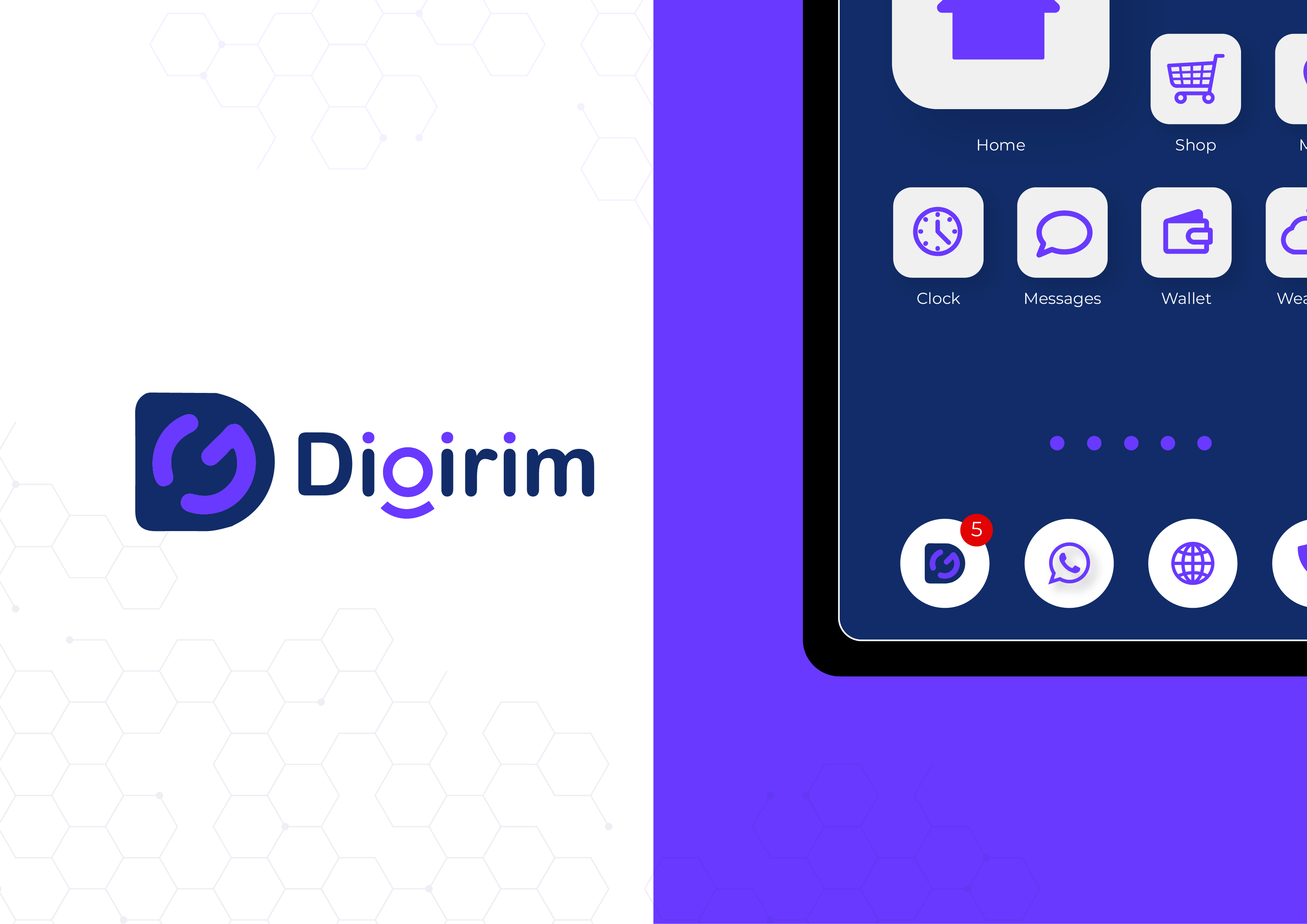
The logo is a stylized letter “D” — but not just any “D”. It’s a container for movement , connection and flow . That’s because Digirim isn’t just a service — it’s a digital ecosystem that integrates branding, design, and tech across platforms.
This swoop and circle concept isn’t random. It represents:
A smart logo captures both brand promise and personality.
The typeface chosen is clean, rounded, modern — friendly enough to attract clients, serious enough to build trust.
And that standout “g” and “i”?
That little curve under the “g”? That’s not just a shape — it’s a subtle smile . A micro-gesture that says:
We’re good at what we do — and it shows.
This kind of subtle storytelling is what professional branding studios in Ahmedabad bring to the table.
The palette isn’t random either:
Combined, they signal that Digirim is both reliable and forward-looking . That’s not “design for design’s sake.” That’s design with strategy — the kind that makes websites convert better, pitch decks land stronger, and brand recall stick.
Look: any tool can spit out shapes.
But a professional logo design in Ahmedabad — especially from a studio that understands branding strategy — does much more:
Good logos tell stories. Great ones make people feel something . The Digirim mark doesn’t just identify — it connects.
A few key principles every modern brand should remember when crafting a logo:
This is why investing in quality logo design in Ahmedabad — by a professional who understands both brand psychology and business goals — is never a luxury. It’s a necessity.
The Digirim logo is:
And that’s exactly why it works.
It doesn’t just show up.
It communicates.
It promises.
It persuades.
This is how brand identity design should be.
Your logo isn’t just a picture. It’s the starting point of your brand’s language online and offline. If it looks disconnected or unclear, users judge before they read. If it’s strategic, thoughtful, and consistent — it becomes a brand asset , not a decoration.
That’s the kind of work we do at Sanjh Studio — where logo design isn’t art for art’s sake… it’s a strategic engine for brand growth.
Your email address will not be published. Required fields are marked *